Brand Guidelines

Anchor down. Stay a while.

Bell & Anchor is new American seafood, rooted in the spirit of Sag Harbor—where maritime heritage, local ingredients, and the most genuine hospitality come together to make sure that people enjoy! These guidelines preserve and express that identity with clarity and consistency across every touchpoint.

This document is a living reference for anyone who creates on behalf of Bell & Anchor. Use it to stay true to the brand — its character, its voice, and the visual language that carries both.

Contents

01 Brand Strategy

Bell & Anchor celebrates over a decade as Sag Harbor’s neighborhood seafood restaurant—where quality food is shared with family and friends – all with a waterfront view.
Person with iPad

This rebrand is not a reinvention — it's a refinement. The essence of Bell & Anchor remains unchanged: honest food, genuine hospitality, and a deep connection to the maritime landscape that surrounds us. What we've sharpened is how we express it.

Our visual and verbal identity now works harder to reflect the quality of what happens inside — from the magic in the kitchen to the laughter at the tables. We’re all here to have a good time and every element of this brand should feel like something you'd find here: crafted, coastal, and friendly.

The goal is a brand that feels familiar to every regular and immediately legible to every first-time guest — one that earns trust before the first dish arrives.

02 Personality

Respect what’s been built and elevate through restraint:

Developing a brand that feels familiar to every partner and team member, yet more refined, cohesive, and effortless to apply consistently.

Design-led homes and communities, masterfully built to embrace daily living through architecture, craftsmanship, and enduring quality.
"precise, trustworthy, approachable, reliable"

Tone & Voice

Dinner

A menu built around what's fresh and often sourced locally. Confident cooking with a light hand — New American at its most honest.

Bar & Cocktails

A carefully tended bar with artisanal cocktails that lean on coastal flavors, a considered wine list, and craft beer for the nights when that's exactly right.

The Space

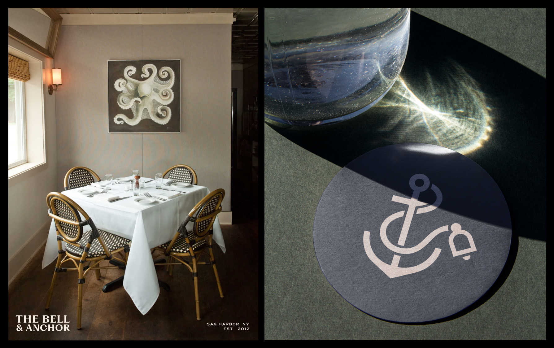
An old converted marina building right on the water. It’s open, warm, and familiar – where sunset light meets candlelight. Whether you're at the bar or on the patio, you feel like you're supposed to be here.

Sample Copy

Seasonal

Summer starts early at Bell & Anchor. The patio is open, the oysters are cold, and the kitchen is ready. Come find your table.

About

We draw from the waters of Peconic Bay and the farms of the East End. The menu changes with what's available and what's good.

Homepage

New American Seafood in Sag Harbor. Open Tuesday through Sunday, from 5:30pm. Reservations recommended.

Lorem ipsum dolor sit amet

A table by the water.

Book yours before the season fills.

03 Logo

The Bell & Anchor wordmark is the primary expression of the brand. It carries the weight of the name — grounded, legible, and quietly distinguished. The anchor symbol serves as a secondary mark, used independently when context is clear and space is limited.

Both elements were designed to hold up across contexts: embossed on a menu cover, printed on paper, displayed on a digital header. The logo should always be reproduced from approved files. Never recreate, trace, or approximate it.

Primary Lockup

Clearspace
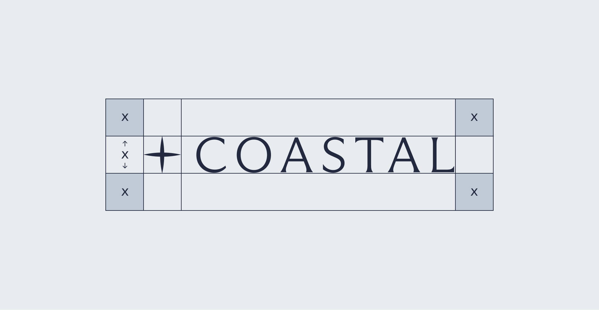
Full Lockup

Symbol + Wordmark

B

E

L

L

&

O

R

·

S

A

G

H

A

R

B

O

R

,

N

Y

·

A

N

C

H

Incorrect Usage

Image of brand logo incorrectly sized

do not add shadows

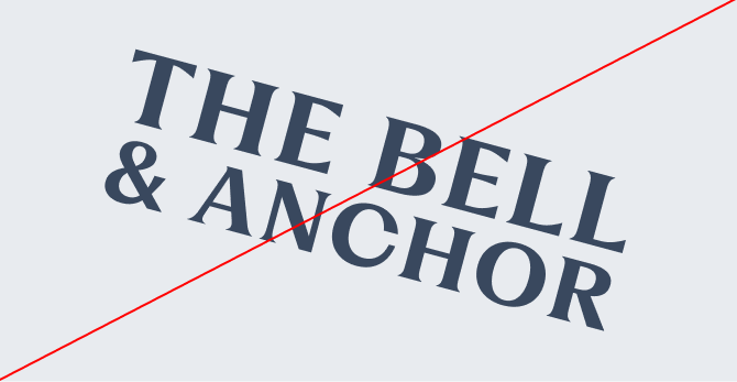
Image of brand logo incorrectly rotated

Do not rotate The logo

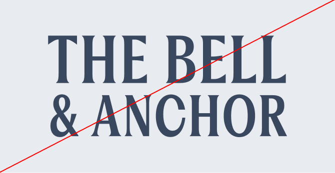
Image of brand logo incorrectly colored

DO NOt stretch The logo

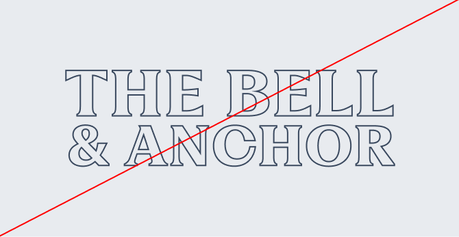
Image of brand logo incorrectly outlined

Do not outline the logo

Image of brand logo incorrectly ordered

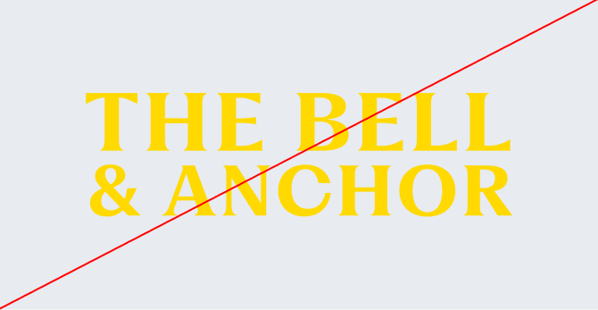
Do not use colors that are not in the brand palette

Image of brand logo incorrectly using gradients

Do not change the established space between each letter or lines

04 Color

The Bell & Anchor palette draws from the landscape that defines Sag Harbor — deep harbor blues, weathered brass, salt-bleached whites, and the dark warmth of old timber. Each color was chosen to feel at home on the water's edge.

The primary palette anchors all branded materials. Secondary and accent colors support hierarchy, create warmth, and add range across digital and print applications. Use them consistently — color is one of the fastest ways to build recognition.

Primary Palette

Imperial Blue

Hex: #39485E

RGB: 57, 72, 94

CMYK: tBD

PANTONE: tBD

Parchment

Hex: #F8F2EF

RGB: 248, 242, 239

CMYK: tBD

PANTONE: tBD

Camel

Hex: #B48849

RGB: 180, 136, 73

CMYK: tBD

PANTONE: tBD

Pure Black

Hex: #000000

RGB: 0, 0, 0

CMYK: tBD

PANTONE: tBD

Deep Blue

Hex: #333C49

RGB: 51, 60, 73

CMYK: tBD

PANTONE: tBD

Secondary Palette

Dodger Blue

Hex: #3895F3

RGB: 56, 149, 243

CMYK: tBD

PANTONE: tBD

Eggshell

Hex: #E9E3CE

RGB: 233, 227, 206

CMYK: tBD

PANTONE: tBD

tomato

Hex: #F35D38

RGB: 243, 93, 56

CMYK: tBD

PANTONE: tBD

Accents & Details

DARK GREY

Hex: #999999

RGB: 153, 153, 153

CMYK: tBD

PANTONE: tBD

GREY

Hex: #B2B2B2

RGB: 178, 178, 178

CMYK: tBD

PANTONE: tBD

05 Typography

Typography carries the brand's voice in written form. The Bell & Anchor type system pairs a refined serif display face with a clean, utilitarian sans-serif — the contrast between craft and function that defines the restaurant itself.

Large letters in brand typography

Fragment — Primary Typeface Fragment is a contemporary serif with roots in classical proportions. Used for headlines, display text, and moments where the brand needs to make a quiet impression. It brings authority without formality — precise, but never cold.

Large letters in brand typography

Helvetica — Secondary Typeface Helvetica is the working typeface of the brand. Legible at any size, neutral in tone, and versatile across print and digital contexts. It carries the everyday voice of Bell & Anchor: direct, honest, and unpretentious.

Together, these two typefaces create a system that can shift between elegant and functional — from a dinner menu to a social post — while remaining unmistakably consistent.

Primary Typeface

Fragment

Secondary Typeface

Helvetica

Sizing

Type scales are defined by context and hierarchy. Larger sizes carry display weight and rely on generous leading to breathe. Smaller body copy prioritizes readability above all else. Follow the specifications below for consistent results across all materials.

Primary Typeface

OPEN TUESDAY THROUGH SUNDAY FROM 5:30PM. RESERVATIONS RECOMMENDED. 3253 NOYAC ROAD, SAG HARBOR, NY.

Type Sizes 0–55pt/px

130% Leading

10% Tracking

From dock to dish, farm to table, season after season.

Type Sizes 55–72pt/px

130% Leading

10% Tracking

Anchor Down.

Stay a While.

Type Sizes > 72pt/px

110% Leading

0% Tracking

Secondary Typeface

Our team works diligently to recover lost funds, correct inaccuracies, and keep your financial records accurate—so you can feel confident about every dollar in your account.

Type Sizes 24–55pt/px

110% Leading

0% Tracking

The restaurant pulls its inspiration from the rich & deep history Sag Harbor, Noyac, Peconic, & the region offer.

Type Sizes 0-20pt/px

110% Leading

0% Tracking

06 Print Application

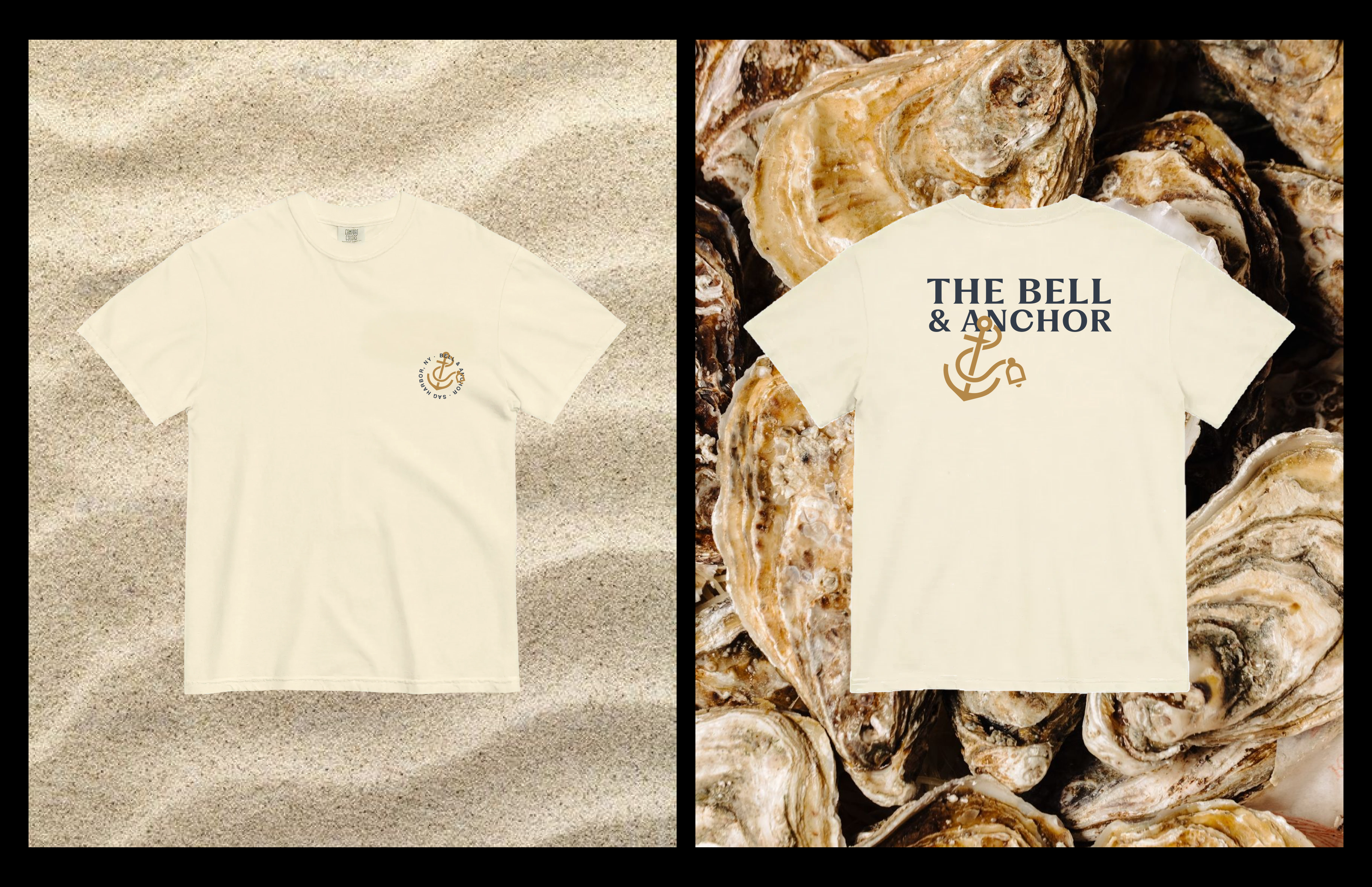
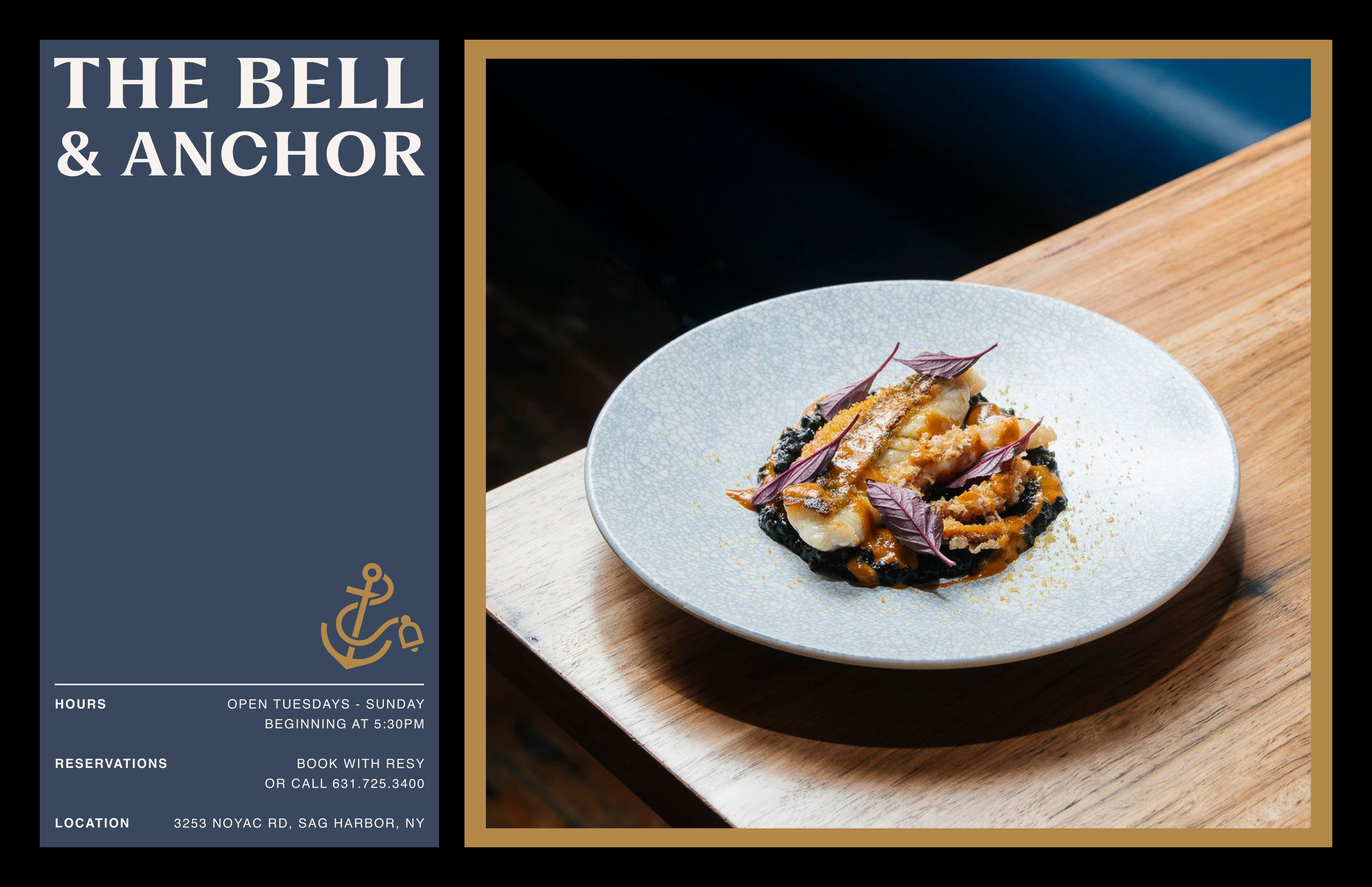
Print is where the Bell & Anchor brand is felt most directly — in the hand, on the table, at the door. Every printed material should reflect the same quality that guests experience in the restaurant: considered, tactile, and worth keeping.

Person sitting on couch working on laptop

07 Digital Application

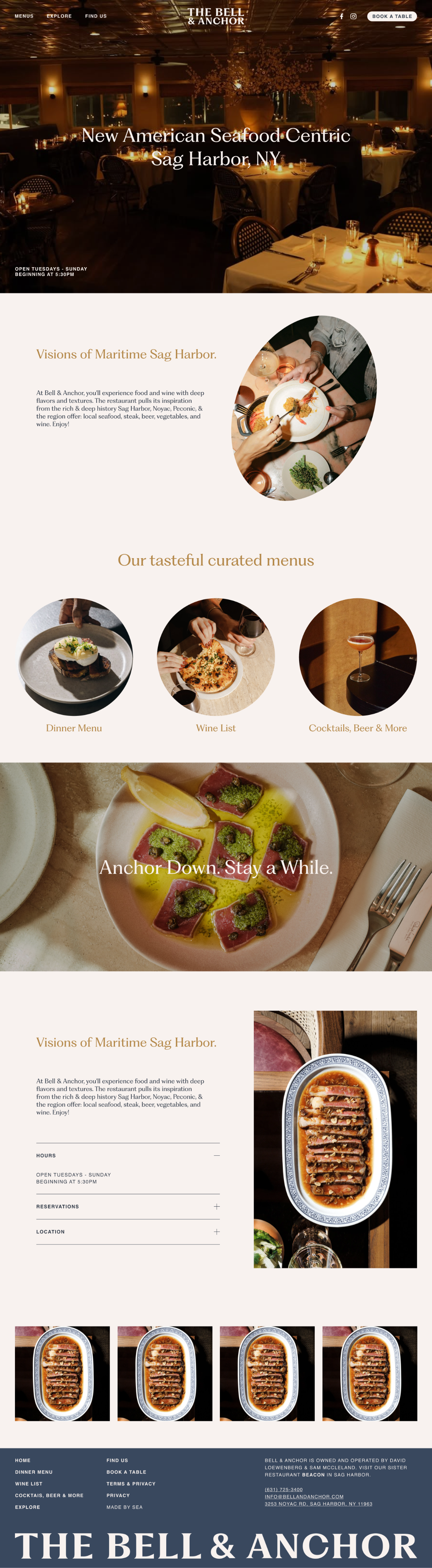
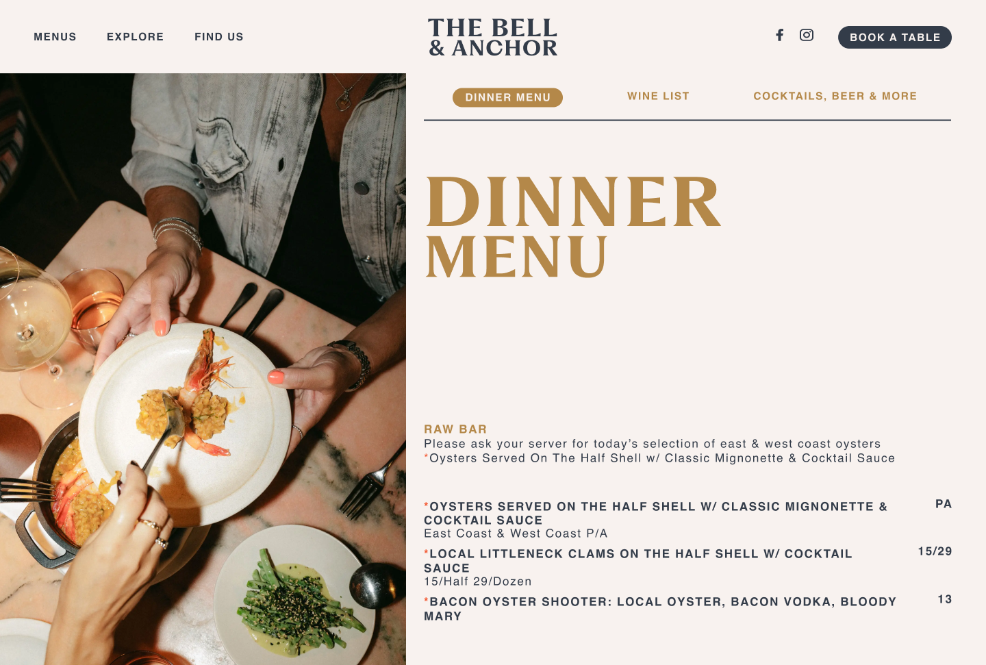
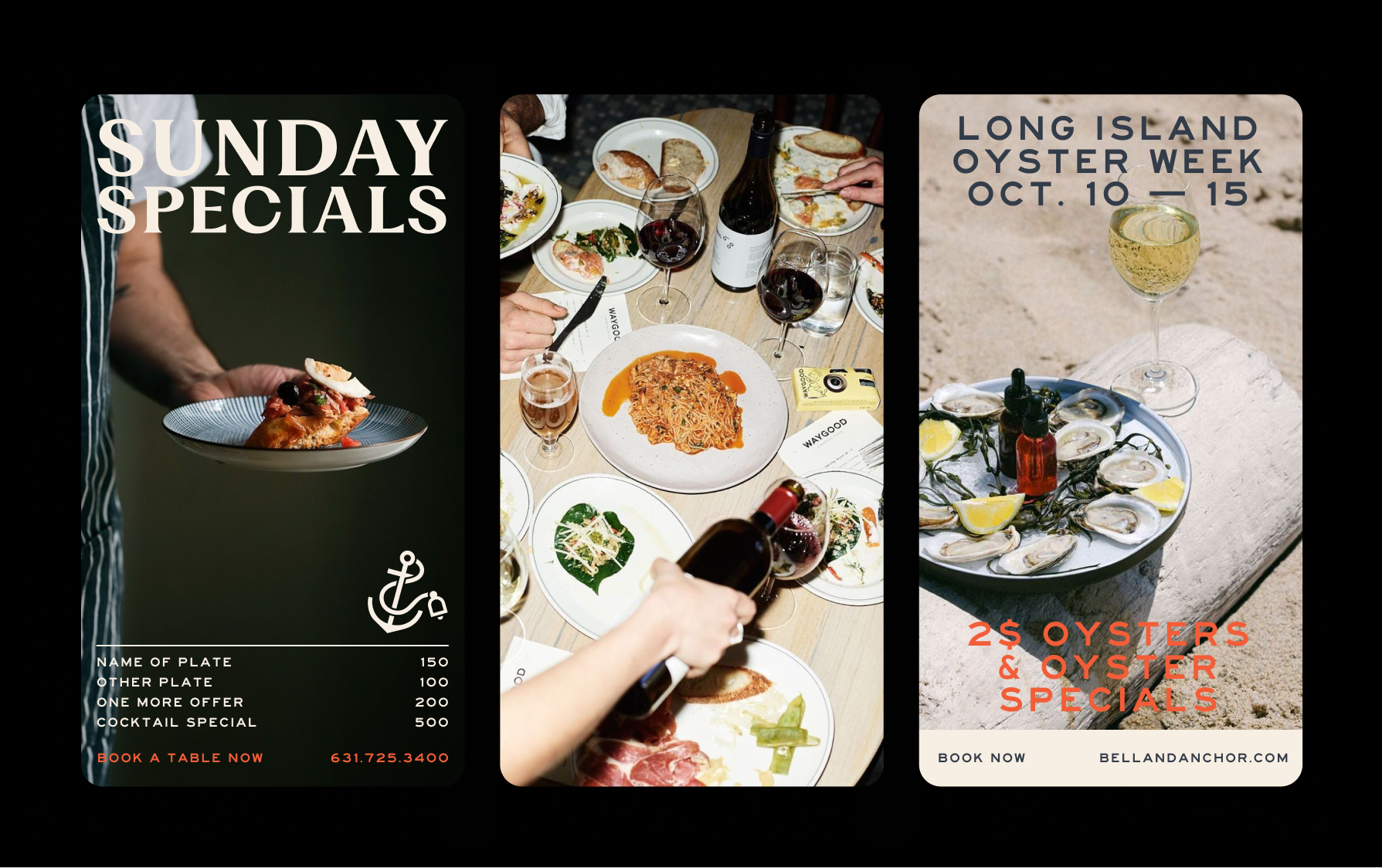
Bell & Anchor's digital presence extends the brand into the spaces where guests first encounter it — on a phone, in a search result, or on a social feed. The same principles that guide print apply here: clarity, consistency, and a quiet confidence.

Person sitting on couch working on laptop

Brand Guidelines

Anchor down. Stay a while.

Bell & Anchor is new American seafood, rooted in the spirit of Sag Harbor—where maritime heritage, local ingredients, and the most genuine hospitality come together to make sure that people enjoy! These guidelines preserve and express that identity with clarity and consistency across every touchpoint.

This document is a living reference for anyone who creates on behalf of Bell & Anchor. Use it to stay true to the brand — its character, its voice, and the visual language that carries both.

Contents

01 Brand Strategy

Bell & Anchor celebrates over a decade as Sag Harbor’s neighborhood seafood restaurant—where quality food is shared with family and friends – all with a waterfront view.

Person with iPad

This rebrand is not a reinvention — it's a refinement. The essence of Bell & Anchor remains unchanged: honest food, genuine hospitality, and a deep connection to the maritime landscape that surrounds us. What we've sharpened is how we express it.

Our visual and verbal identity now works harder to reflect the quality of what happens inside — from the magic in the kitchen to the laughter at the tables. We’re all here to have a good time and every element of this brand should feel like something you'd find here: crafted, coastal, and friendly.

The goal is a brand that feels familiar to every regular and immediately legible to every first-time guest — one that earns trust before the first dish arrives.

02 Personality

Respect what’s been built and elevate through restraint:

Developing a brand that feels familiar to every partner and team member, yet more refined, cohesive, and effortless to apply consistently.

Design-led homes and communities, masterfully built to embrace daily living through architecture, craftsmanship, and enduring quality.

"precise, trustworthy, approachable, reliable"

Tone & Voice

Dinner

A menu built around what's fresh and often sourced locally. Confident cooking with a light hand — New American at its most honest.

Bar & Cocktails

A carefully tended bar with artisanal cocktails that lean on coastal flavors, a considered wine list, and craft beer for the nights when that's exactly right.

The Space

An old converted marina building right on the water. It’s open, warm, and familiar – where sunset light meets candlelight. Whether you're at the bar or on the patio, you feel like you're supposed to be here.

Sample Copy

Lorem ipsum dolor sit amet

A table by the water.

Book yours before the season fills.

Homepage

New American Seafood in Sag Harbor. Open Tuesday through Sunday, from 5:30pm. Reservations recommended.

About

We draw from the waters of Peconic Bay and the farms of the East End. The menu changes with what's available and what's good.

Seasonal

Summer starts early at Bell & Anchor. The patio is open, the oysters are cold, and the kitchen is ready. Come find your table.

03 Logo

The Bell & Anchor wordmark is the primary expression of the brand. It carries the weight of the name — grounded, legible, and quietly distinguished. The anchor symbol serves as a secondary mark, used independently when context is clear and space is limited.

Both elements were designed to hold up across contexts: embossed on a menu cover, printed on paper, displayed on a digital header. The logo should always be reproduced from approved files. Never recreate, trace, or approximate it.

Primary Lockup

Clearspace
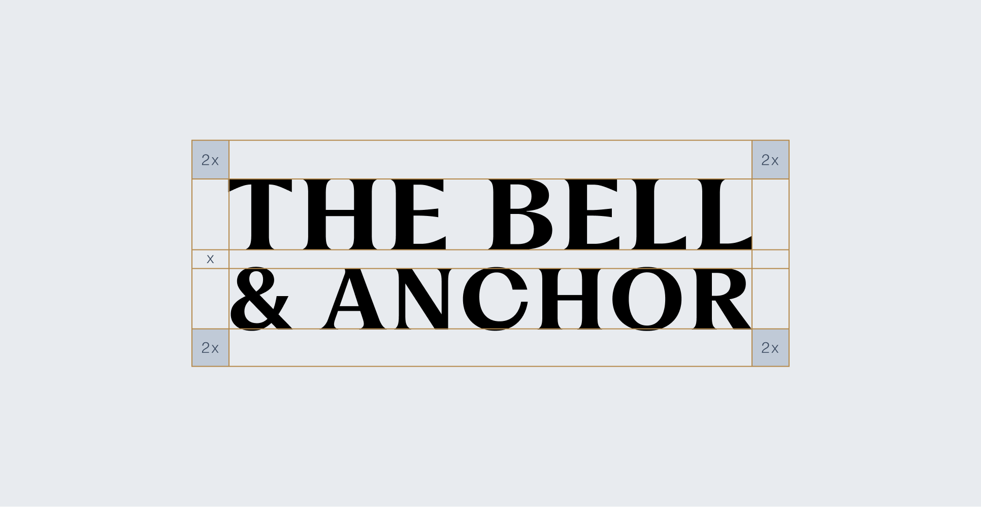
Full Lockup

Symbol + Wordmark

B

E

L

L

&

O

R

·

S

A

G

H

A

R

B

O

R

,

N

Y

·

A

N

C

H

Incorrect Usage

Image of brand logo incorrectly sized

do not add shadows

Image of brand logo incorrectly rotated

Do not rotate The logo

Image of brand logo incorrectly colored

DO NOt stretch The logo

Image of brand logo incorrectly outlined

Do not outline the logo

Image of brand logo incorrectly ordered

Do not use colors that are not in the brand palette

Image of brand logo incorrectly using gradients

Do not change the established space between each letter or lines

04 Color

The Bell & Anchor palette draws from the landscape that defines Sag Harbor — deep harbor blues, weathered brass, salt-bleached whites, and the dark warmth of old timber. Each color was chosen to feel at home on the water's edge.

The primary palette anchors all branded materials. Secondary and accent colors support hierarchy, create warmth, and add range across digital and print applications. Use them consistently — color is one of the fastest ways to build recognition.

Primary Palette

Pure Black

Hex: #000000

RGB: 0, 0, 0

CMYK: tBD

PANTONE: tBD

Imperial Blue

Hex: #39485E

RGB: 57, 72, 94

CMYK: tBD

PANTONE: tBD

Camel

Hex: #B48849

RGB: 180, 136, 73

CMYK: tBD

PANTONE: tBD

Deep Blue

Hex: #333C49

RGB: 51, 60, 73

CMYK: tBD

PANTONE: tBD

Parchment

Hex: #F8F2EF

RGB: 248, 242, 239

CMYK: tBD

PANTONE: tBD

Secondary Palette

Dodger Blue

Hex: #3895F3

RGB: 56, 149, 243

CMYK: tBD

PANTONE: tBD

Eggshell

Hex: #E9E3CE

RGB: 233, 227, 206

CMYK: tBD

PANTONE: tBD

tomato

Hex: #F35D38

RGB: 243, 93, 56

CMYK: tBD

PANTONE: tBD

Accents & Details

DARK GREY

Hex: #999999

RGB: 153, 153, 153

CMYK: tBD

PANTONE: tBD

GREY

Hex: #B2B2B2

RGB: 178, 178, 178

CMYK: tBD

PANTONE: tBD

05 Typography

Typography carries the brand's voice in written form. The Bell & Anchor type system pairs a refined serif display face with a clean, utilitarian sans-serif — the contrast between craft and function that defines the restaurant itself.

Large letters in brand typography

Fragment — Primary Typeface Fragment is a contemporary serif with roots in classical proportions. Used for headlines, display text, and moments where the brand needs to make a quiet impression. It brings authority without formality — precise, but never cold.

Large letters in brand typography

Helvetica — Secondary Typeface Helvetica is the working typeface of the brand. Legible at any size, neutral in tone, and versatile across print and digital contexts. It carries the everyday voice of Bell & Anchor: direct, honest, and unpretentious.

Together, these two typefaces create a system that can shift between elegant and functional — from a dinner menu to a social post — while remaining unmistakably consistent.

Primary Typeface

Fragment

Secondary Typeface

Helvetica

Primary Typeface

OPEN TUESDAY THROUGH SUNDAY FROM 5:30PM. RESERVATIONS RECOMMENDED. 3253 NOYAC ROAD, SAG HARBOR, NY.

Type Sizes 0–55pt/px

130% Leading

10% Tracking

From dock to dish, farm to table, season after season.

Type Sizes 55–72pt/px

130% Leading

10% Tracking

Anchor Down.

Stay a While.

Type Sizes > 72pt/px

110% Leading

0% Tracking

Sizing

Type scales are defined by context and hierarchy. Larger sizes carry display weight and rely on generous leading to breathe. Smaller body copy prioritizes readability above all else. Follow the specifications below for consistent results across all materials.

Secondary Typeface

Our team works diligently to recover lost funds, correct inaccuracies, and keep your financial records accurate—so you can feel confident about every dollar in your account.

Type Sizes 24–55pt/px

110% Leading

0% Tracking

The restaurant pulls its inspiration from the rich & deep history Sag Harbor, Noyac, Peconic, & the region offer.

Type Sizes 0-20pt/px

110% Leading

0% Tracking

06 Print Application

Print is where the Bell & Anchor brand is felt most directly — in the hand, on the table, at the door. Every printed material should reflect the same quality that guests experience in the restaurant: considered, tactile, and worth keeping.

Person sitting on couch working on laptop

07 Digital Application

Bell & Anchor's digital presence extends the brand into the spaces where guests first encounter it — on a phone, in a search result, or on a social feed. The same principles that guide print apply here: clarity, consistency, and a quiet confidence.

Person sitting on couch working on laptop

Brand Guidelines

Anchor down. Stay a while.

Bell & Anchor is new American seafood, rooted in the spirit of Sag Harbor—where maritime heritage, local ingredients, and the most genuine hospitality come together to make sure that people enjoy! These guidelines preserve and express that identity with clarity and consistency across every touchpoint.

This document is a living reference for anyone who creates on behalf of Bell & Anchor. Use it to stay true to the brand — its character, its voice, and the visual language that carries both.

Contents

01 Brand Strategy

Bell & Anchor celebrates over a decade as Sag Harbor’s neighborhood seafood restaurant—where quality food is shared with family and friends – all with a waterfront view.

Person with iPad

This rebrand is not a reinvention — it's a refinement. The essence of Bell & Anchor remains unchanged: honest food, genuine hospitality, and a deep connection to the maritime landscape that surrounds us. What we've sharpened is how we express it.

Our visual and verbal identity now works harder to reflect the quality of what happens inside — from the magic in the kitchen to the laughter at the tables. We’re all here to have a good time and every element of this brand should feel like something you'd find here: crafted, coastal, and friendly.

The goal is a brand that feels familiar to every regular and immediately legible to every first-time guest — one that earns trust before the first dish arrives.

02 Personality

New American seafood, rooted in the coastal character of Sag Harbor. The restaurant pulls its inspiration from the rich and deep history of Sag Harbor, Noyac, Peconic, and the region offer: local seafood, new takes on the classic meat dishes, wine to pair, and crafted cocktails.

"precise, trustworthy, approachable, reliable"

Tone & Voice

Dinner

A menu built around what's fresh and often sourced locally. Confident cooking with a light hand — New American at its most honest.

Bar & Cocktails

A carefully tended bar with artisanal cocktails that lean on coastal flavors, a considered wine list, and craft beer for the nights when that's exactly right.

The Space

An old converted marina building right on the water. It’s open, warm, and familiar – where sunset light meets candlelight. Whether you're at the bar or on the patio, you feel like you're supposed to be here.

Sample Copy

Reservations

A table by the water.

Book yours before the season fills.

Homepage

New American Seafood in Sag Harbor. Open Tuesday through Sunday, from 5:30pm. Reservations recommended.

About

We draw from the waters of Peconic Bay and the farms of the East End. The menu changes with what's available and what's good.

Seasonal

Summer starts early at Bell & Anchor. The patio is open, the oysters are cold, and the kitchen is ready. Come find your table.

03 Logo

The Bell & Anchor wordmark is the primary expression of the brand. It carries the weight of the name — grounded, legible, and quietly distinguished. The anchor symbol serves as a secondary mark, used independently when context is clear and space is limited.

Both elements were designed to hold up across contexts: embossed on a menu cover, printed on paper, displayed on a digital header. The logo should always be reproduced from approved files. Never recreate, trace, or approximate it.

Primary Lockup

Clearspace

Full Lockup

Symbol + Wordmark

B

E

L

L

&

O

R

·

S

A

G

H

A

R

B

O

R

,

N

Y

·

A

N

C

H

Incorrect Usage
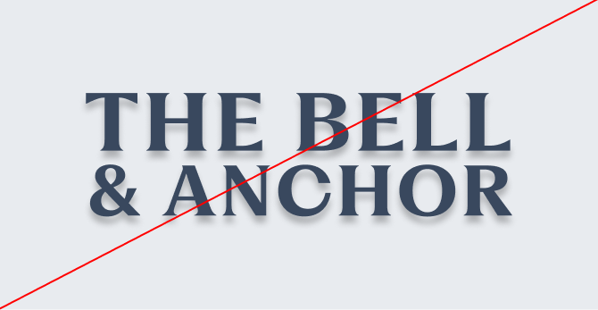
Image of brand logo incorrectly sized

do not add shadows

Image of brand logo incorrectly rotated

Do not rotate The logo

Image of brand logo incorrectly colored

DO NOt stretch The logo

Image of brand logo incorrectly outlined

Do not outline the logo

Image of brand logo incorrectly ordered

Do not use colors that are not in the brand palette
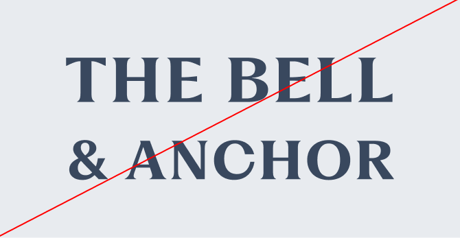
Image of brand logo incorrectly using gradients

Do not change the established space between each letter or lines

04 Color

The Bell & Anchor palette draws from the landscape that defines Sag Harbor — deep harbor blues, weathered brass, salt-bleached whites, and the dark warmth of old timber. Each color was chosen to feel at home on the water's edge.

The primary palette anchors all branded materials. Secondary and accent colors support hierarchy, create warmth, and add range across digital and print applications. Use them consistently — color is one of the fastest ways to build recognition.

Primary Palette

Imperial Blue

Hex: #39485E

RGB: 57, 72, 94

CMYK: tBD

PANTONE: tBD

Pure Black

Hex: #000000

RGB: 0, 0, 0

CMYK: tBD

PANTONE: tBD

Deep Blue

Hex: #333C49

RGB: 51, 60, 73

CMYK: tBD

PANTONE: tBD

Camel

Hex: #B48849

RGB: 180, 136, 73

CMYK: tBD

PANTONE: tBD

Parchment

Hex: #F8F2EF

RGB: 248, 242, 239

CMYK: tBD

PANTONE: tBD

Secondary Palette

Dodger Blue

Hex: #3895F3

RGB: 56, 149, 243

CMYK: tBD

PANTONE: tBD

Eggshell

Hex: #E9E3CE

RGB: 233, 227, 206

CMYK: tBD

PANTONE: tBD

tomato

Hex: #F35D38

RGB: 243, 93, 56

CMYK: tBD

PANTONE: tBD

Accents & Details

DARK GREY

Hex: #999999

RGB: 153, 153, 153

CMYK: tBD

PANTONE: tBD

GREY

Hex: #B2B2B2

RGB: 178, 178, 178

CMYK: tBD

PANTONE: tBD

05 Typography

Typography carries the brand's voice in written form. The Bell & Anchor type system pairs a refined serif display face with a clean, utilitarian sans-serif — the contrast between craft and function that defines the restaurant itself.
Large letters in brand typography

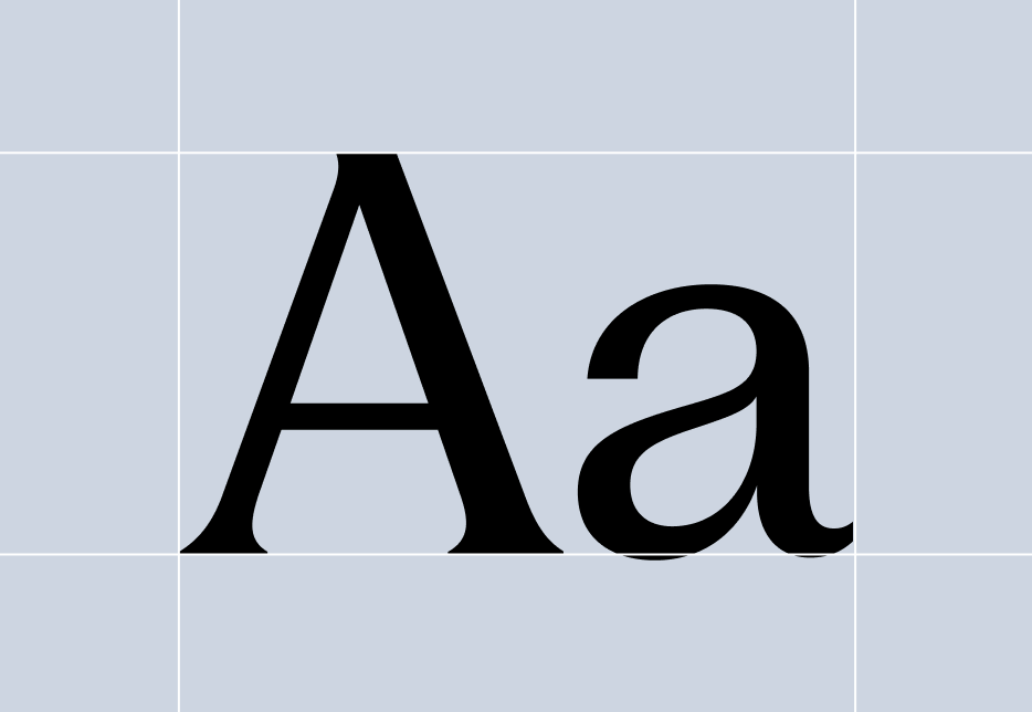
Fragment — Primary Typeface Fragment is a contemporary serif with roots in classical proportions. Used for headlines, display text, and moments where the brand needs to make a quiet impression. It brings authority without formality — precise, but never cold.
Large letters in brand typography

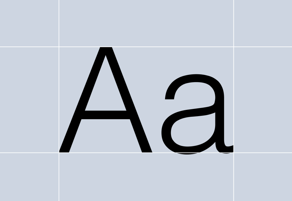
Helvetica — Secondary Typeface Helvetica is the working typeface of the brand. Legible at any size, neutral in tone, and versatile across print and digital contexts. It carries the everyday voice of Bell & Anchor: direct, honest, and unpretentious.

Together, these two typefaces create a system that can shift between elegant and functional — from a dinner menu to a social post — while remaining unmistakably consistent.

Primary Typeface

Fragment

Secondary Typeface

Helvetica

Sizing

Type scales are defined by context and hierarchy. Larger sizes carry display weight and rely on generous leading to breathe. Smaller body copy prioritizes readability above all else. Follow the specifications below for consistent results across all materials.

Primary Typeface

Anchor Down.

Stay a While.

Type Sizes > 72pt/px

110% Leading

0% Tracking

From dock to dish, farm to table, season after season.

Type Sizes 55–72pt/px

130% Leading

10% Tracking

OPEN TUESDAY THROUGH SUNDAY FROM 5:30PM. RESERVATIONS RECOMMENDED. 3253 NOYAC ROAD, SAG HARBOR, NY.

Type Sizes 0–55pt/px

130% Leading

10% Tracking

Secondary Typeface

New American Seafood Centric

Type Sizes > 20pt/px

110% Leading

0% Tracking

The restaurant pulls its inspiration from the rich & deep history Sag Harbor, Noyac, Peconic, & the region offer.

Type Sizes 0-20pt/px

110% Leading

0% Tracking

06 Print Application

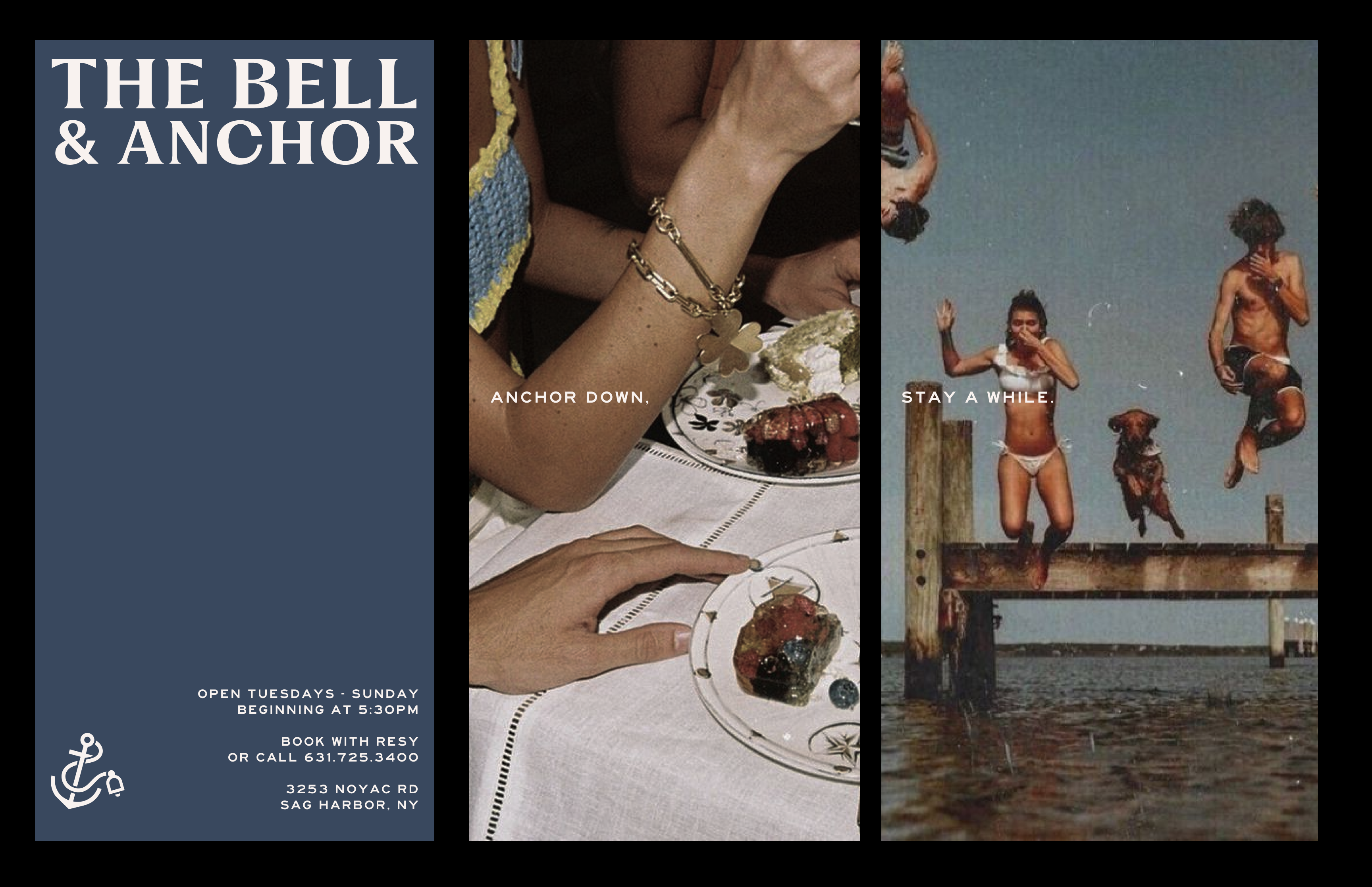
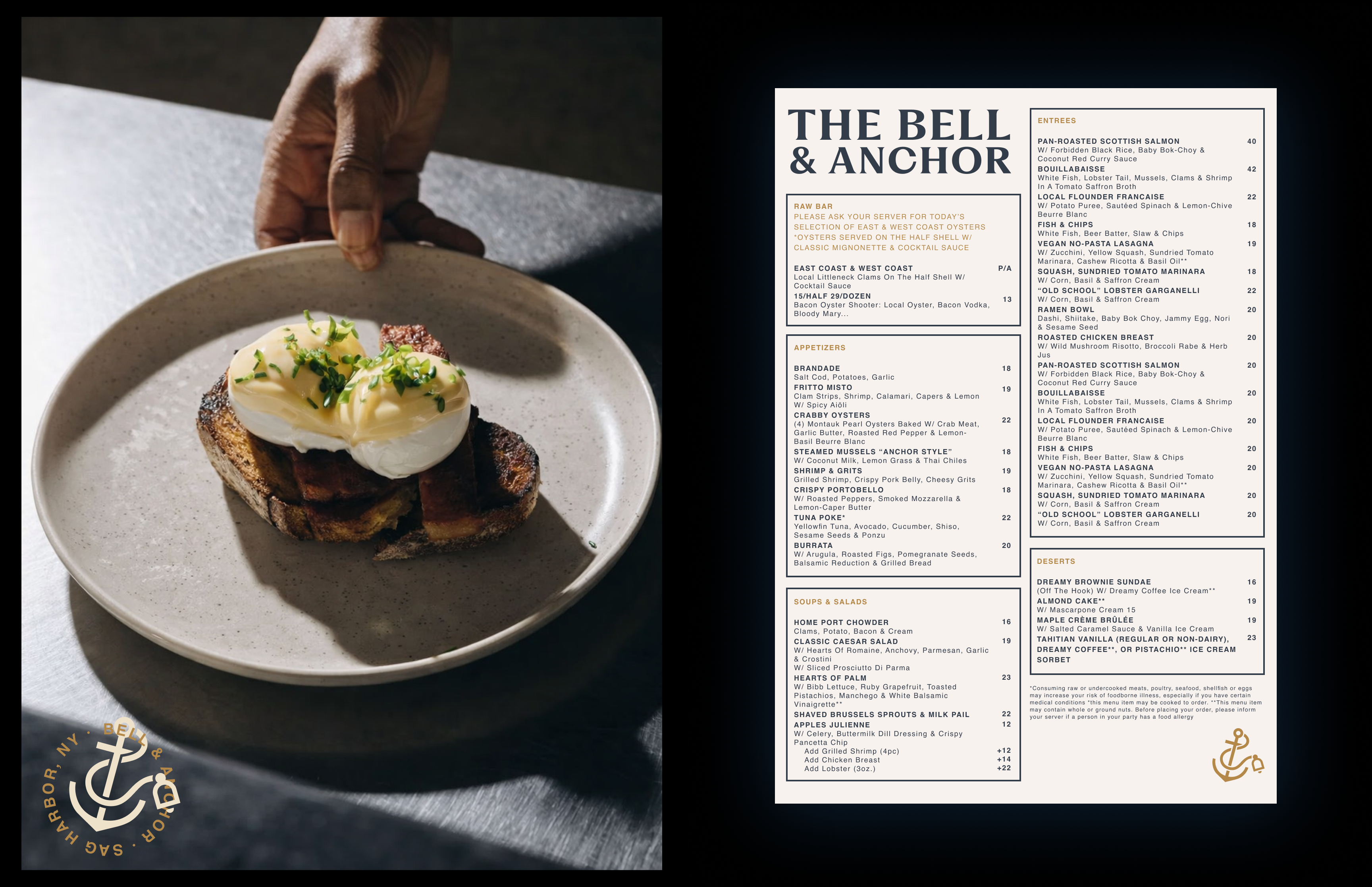
Print is where the Bell & Anchor brand is felt most directly — in the hand, on the table, at the door. Every printed material should reflect the same quality that guests experience in the restaurant: considered, tactile, and worth keeping.
Person sitting on couch working on laptop

07 Digital Application

Bell & Anchor's digital presence extends the brand into the spaces where guests first encounter it — on a phone, in a search result, or on a social feed. The same principles that guide print apply here: clarity, consistency, and a quiet confidence.
Person sitting on couch working on laptop